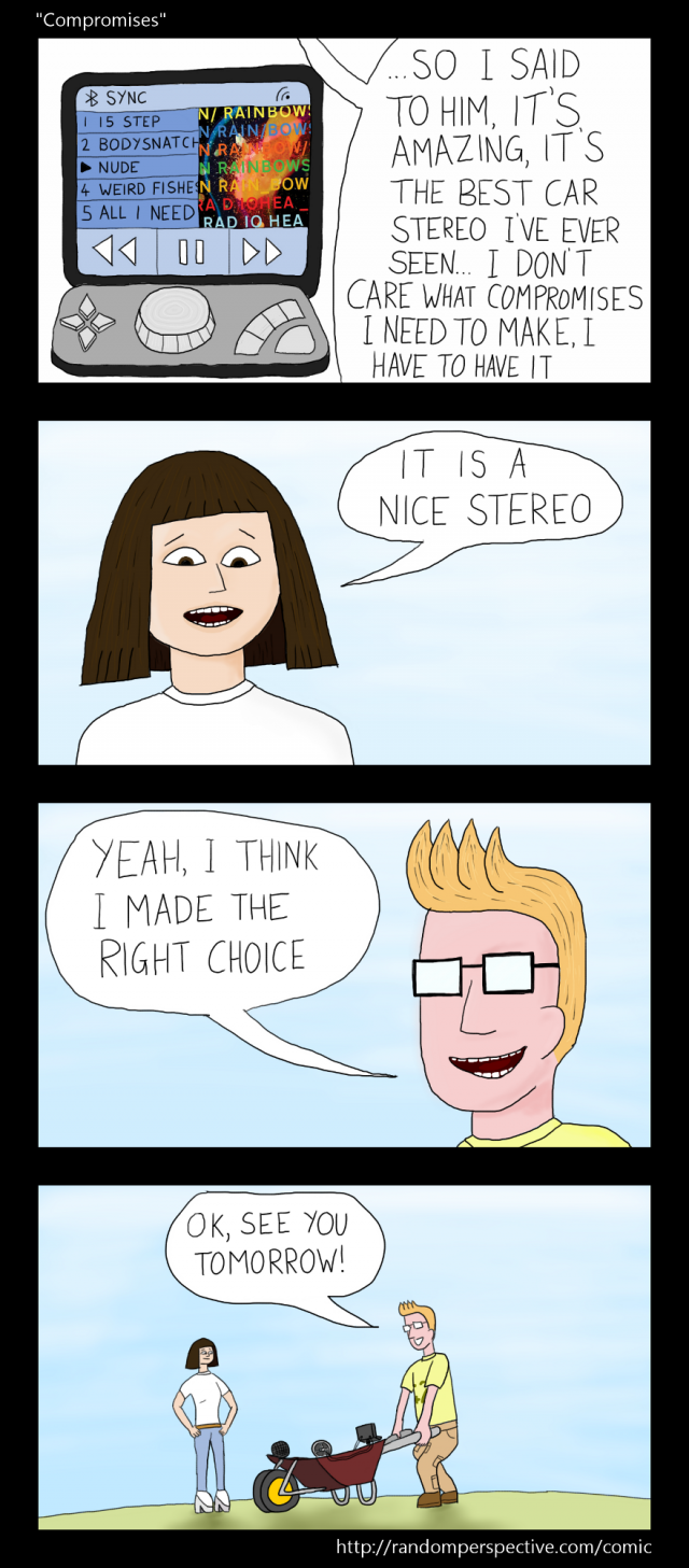
Comic #19 : "Compromises"
Saturday 13th April 2013

Oooooh... change of style!
This joke would not have worked as well had I used my traditional "portrait" layout, by switching to landscape it enabled me to lay out the frames better, and then doing it as a vertical column provided better build up to the final punchline... punchframe?
Because of the fact this featured close ups of the two characters I therefore added more detail and texture to the drawing than in a typical comic.
I spent ages trying to think of a geeky or funny album to have playing on the stereo but in the end just picked one of my favourite albums.


